RAWGraphs Dataview Study
Study releated to SARS-COV Data in relation to Shigellosis
This is for a study related to SARS-associated Coronavirus in relation to Shigellosis, not Covid-19. However, it should still be quite insightful. The original data source is here, the data is labeled for public access and use. All origin data rights (as always) are to its perspective owners. This is just intented as a visualization case study in which we are the perspective visualization authors. All rights of the origin data is to the CDC and the data used for the visualization is part of the data.gov catalog.
Dataview #1
Group: Reporting Area [String]
Date: MMWR Week [#]
Color: Shiga toxin-producing Escherichia coli, Current week, flag [String]
Color Scale: Ordinal (Categories)
Interpolation: Cardinal
Sort by: Original
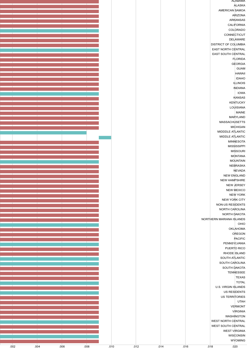
Key Metrics:
MMWR Week Standard Deviation: 6.0573613857
MMWR Week Average/Arthmetic Mean: 11
MMWR Week Median: 11
MMWR Week Mode: 11
The data isn’t too symmetrical even though the Mean and Median are equivalent given the fact that the mode seems more of an outlier though it appears the most i.e 1 in comparison to 11. These weekly averages for reporting area, means likely the more critical point related to this study and the SARS-COV contamination in relation to Shigellosis, was in week 11.
Dataview #2
Hierarchy: Reporting Area [String]
Size: Shigellosis, Cum 2018† [#]
Color: Location 1 [String]
Color scale: Ordinal (Categories)
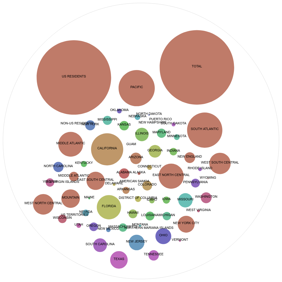
SARS-COV Data in relation to Shigellosis vs. The Covid-19 Outbreak
Something that is interesting to look at is that California has one of the worst contaminations, and New York city is also not doing so well. Florida is doing worse then New York City. In comparison to the 2020 Covid-19 crisis, as of March 21st, New York would have been doing the worst, then California, then Florida out of 3 states. California and New York seemed to have reversed positions in this entirely different study and virus. Although, likely many people would have expected some sort of direct or similar correlation between the two in terms of outcome.
In terms of observational data, one also needs to keep in mind that toxicity and spread changes over time. Some data critical given a study, may not be meaningful given a different study. For example, looking at e-coli traces, oceanic data could be quite critical. When looking at a different outbreak and strand, this sort of data may not be useful. Data in relation to the outbreak happening now, (even though it is SARS-related), the source is different as well as strands, so the same sort of data for a meaningful model wouldn’t be as applicable.
Also, this dataset among other datasets may be quite useful in terms of creating protocols or organized standards in terms of how to avoid an outbreak, predict an outbreak and model such events happening. The more datasets we have like this, the more of a model we will be able to make for bigger pictures. We can have SARS and Coronavirus data for viral stains that are completely unrelated and model those out in ways that may not necessarily give us the big picture on said strand we are analyzing, but may give us a picture on the virus in general. Even when looking at Influenza data, it it important not to just look at one strand of Influenza, but all sort of strands and datasets as a whole in order to better understand the fu. The same applies to genomic cancer, amongst other things. This is why while the data may not be meaningful in terms of analyzing the particular outbreak happening now, it may be meaningful in analyzing what is happening in general through a immunology, pandemic, and viral spread perspective.
Resources:
[1] NNDSS - TABLE 1FF. Severe acute respiratory syndrome-associated coronavirus disease to Shigellosis. (2020, February 26). Retrieved March 21, 2020, from https://catalog.data.gov/dataset/nndss-table-1ff-severe-acute-respiratory-syndrome-associated-coronavirus-disease-to-shigel
[2] Johns Hopkins University & Medicine Coronavirus Resource Center | Map. (2020, January 22). Retrieved March 21, 2020, from https://coronavirus.jhu.edu/map.html